Every Move Matters Fundraising Campaign
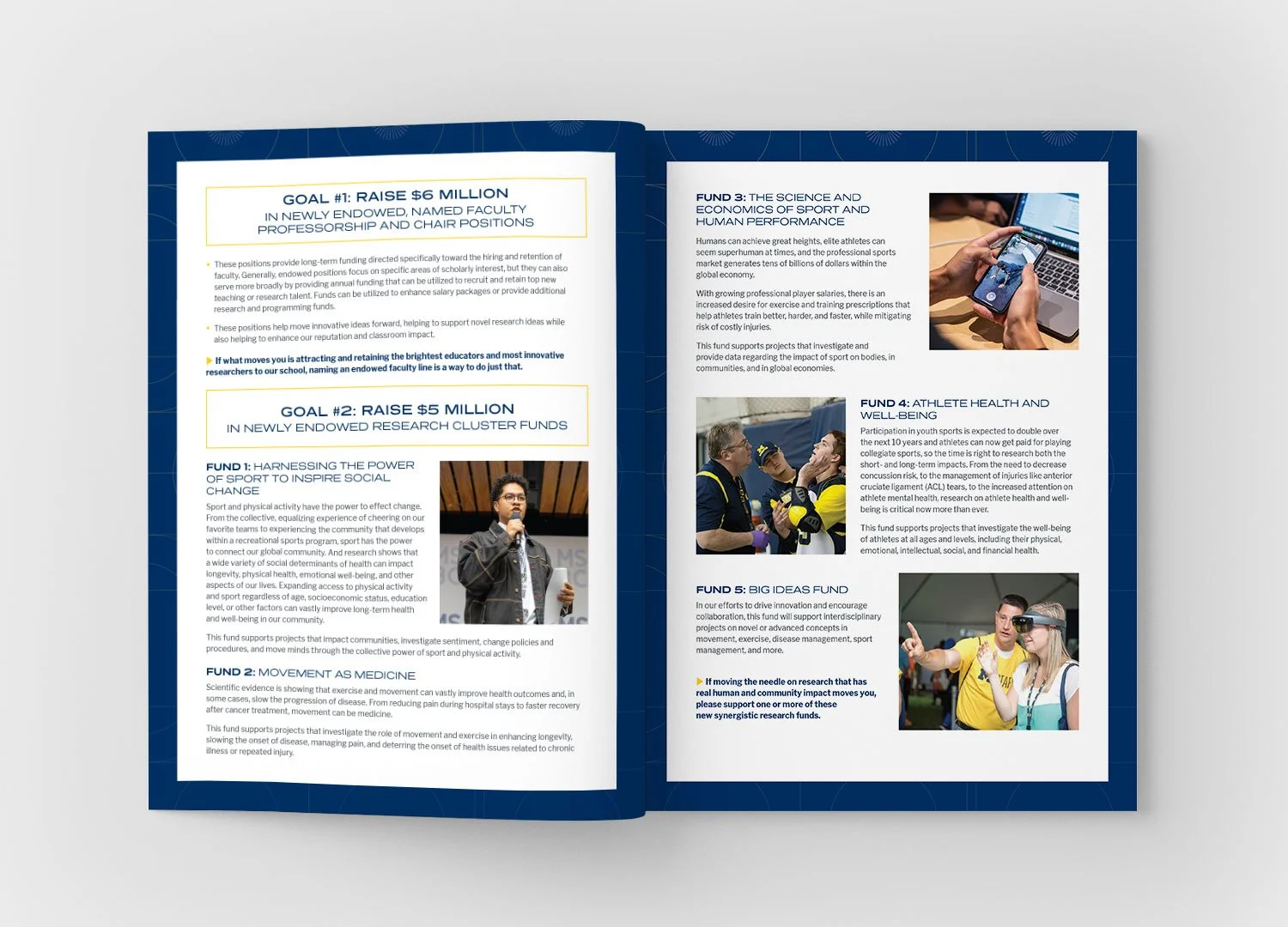
In the fall of 2024, the School of Kinesiology launched its 5-year fundraising campaign in conjunction with the university’s broader Look to Michigan campaign.
Goal
Stay within our school’s brand but expand on it in a way that was specific to the campaign and added excitement and interest. I allowed myself a bit of out-of-the-box exploration at first, but ultimately needed to make sure it was firmly rooted in the U-M brand, with maize and blue front and center.
Energetic/Inspiring
Constantly moving and active
Clean, fresh, no frills
Iterating on the Kinesiology brand
Brand fonts
Existing spark element
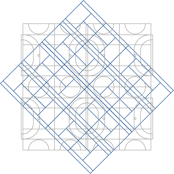
Courtline elements, combined to feel athletic without suggesting something specific.
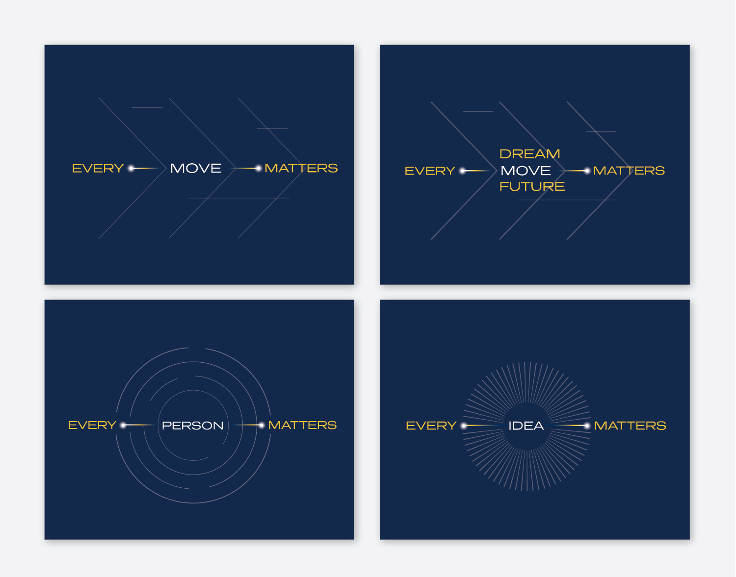
Campaign logo exploration
Even though I ultimately stuck closer to our brand for the final result, I gave myself a bit of time for pushing the envelope. I think this is always a useful exercise, time permitting, giving my brain a catalogue of ideas and allowing creativity. I also did a deep dive on higher ed campaign branding for research.
The final choice
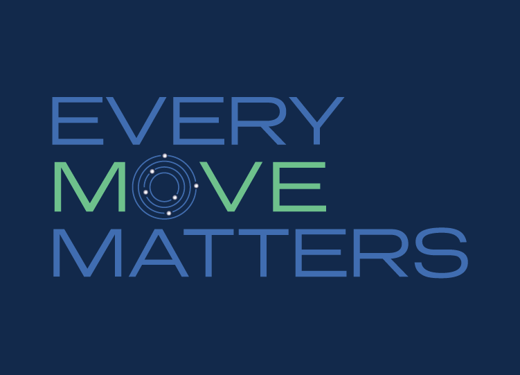
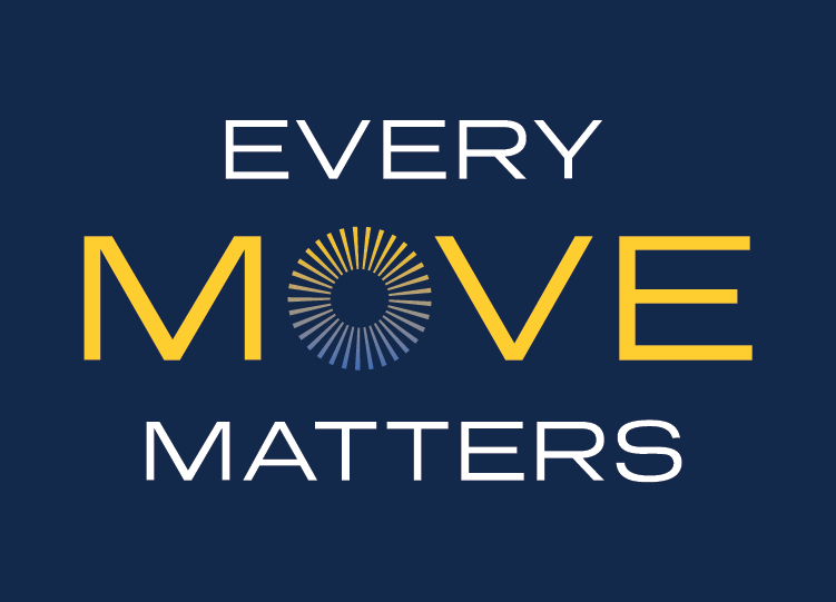
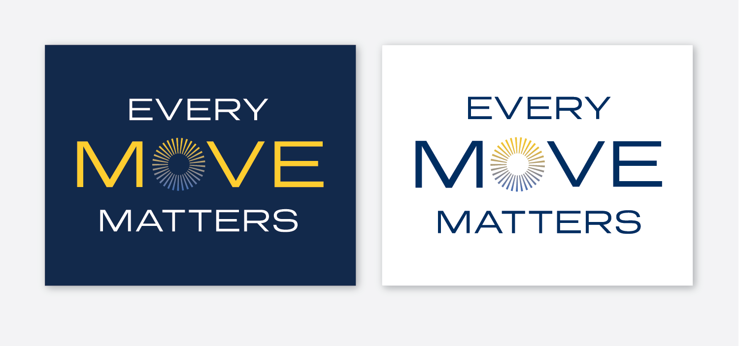
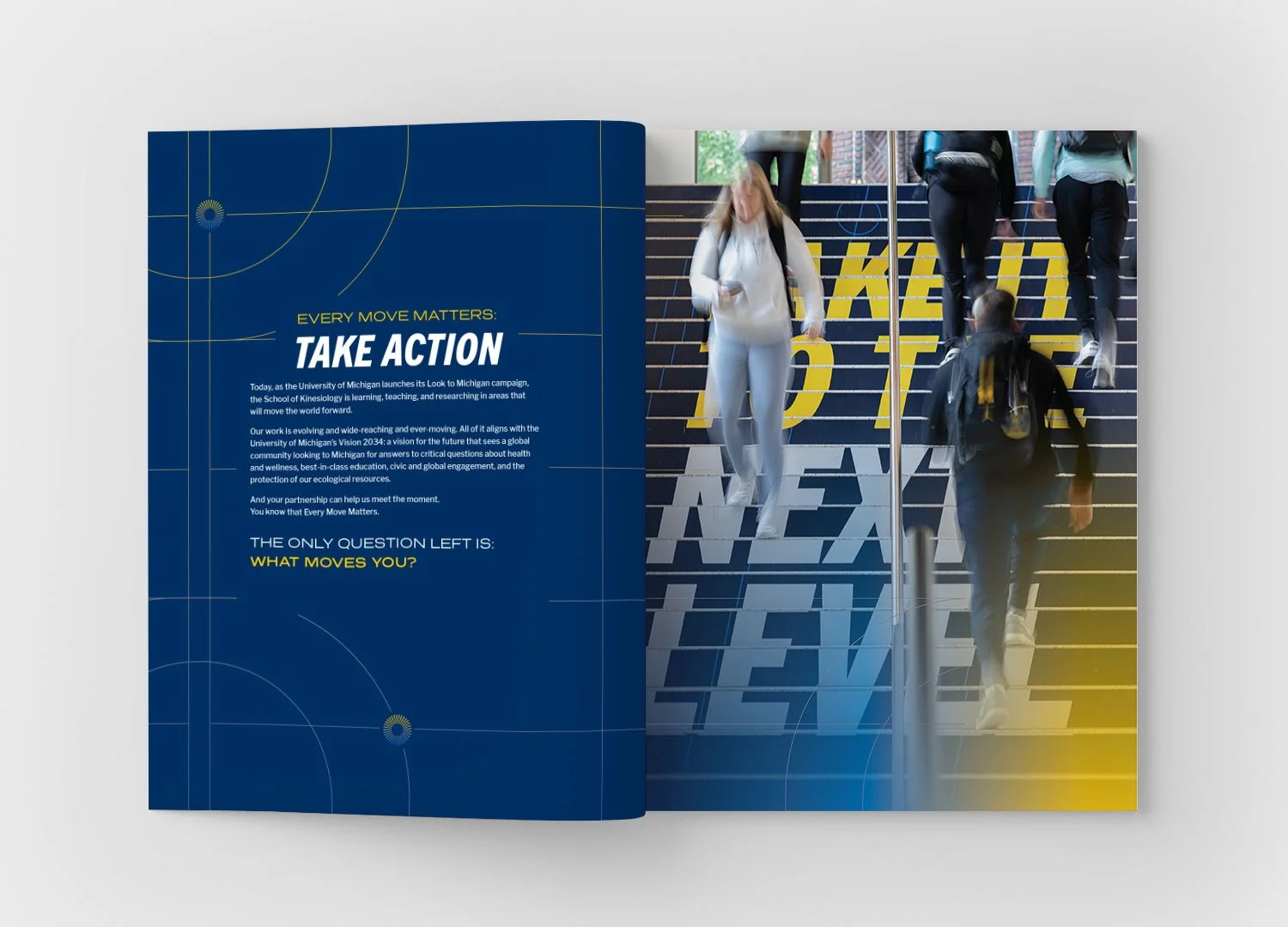
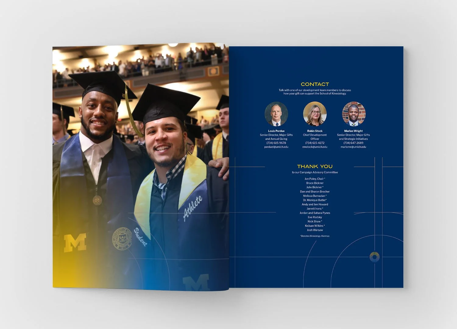
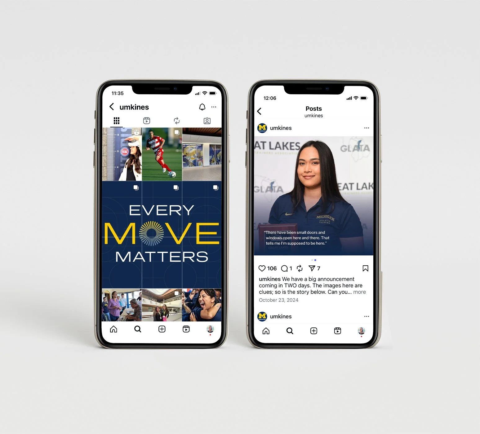
Our stakeholders chose this mark with the more formal Presicav font. I reimagined the spark idea as an icon, where it symbolizes energy, inspiration and beginnings. I used the “dawn” gradient as an element throughout.
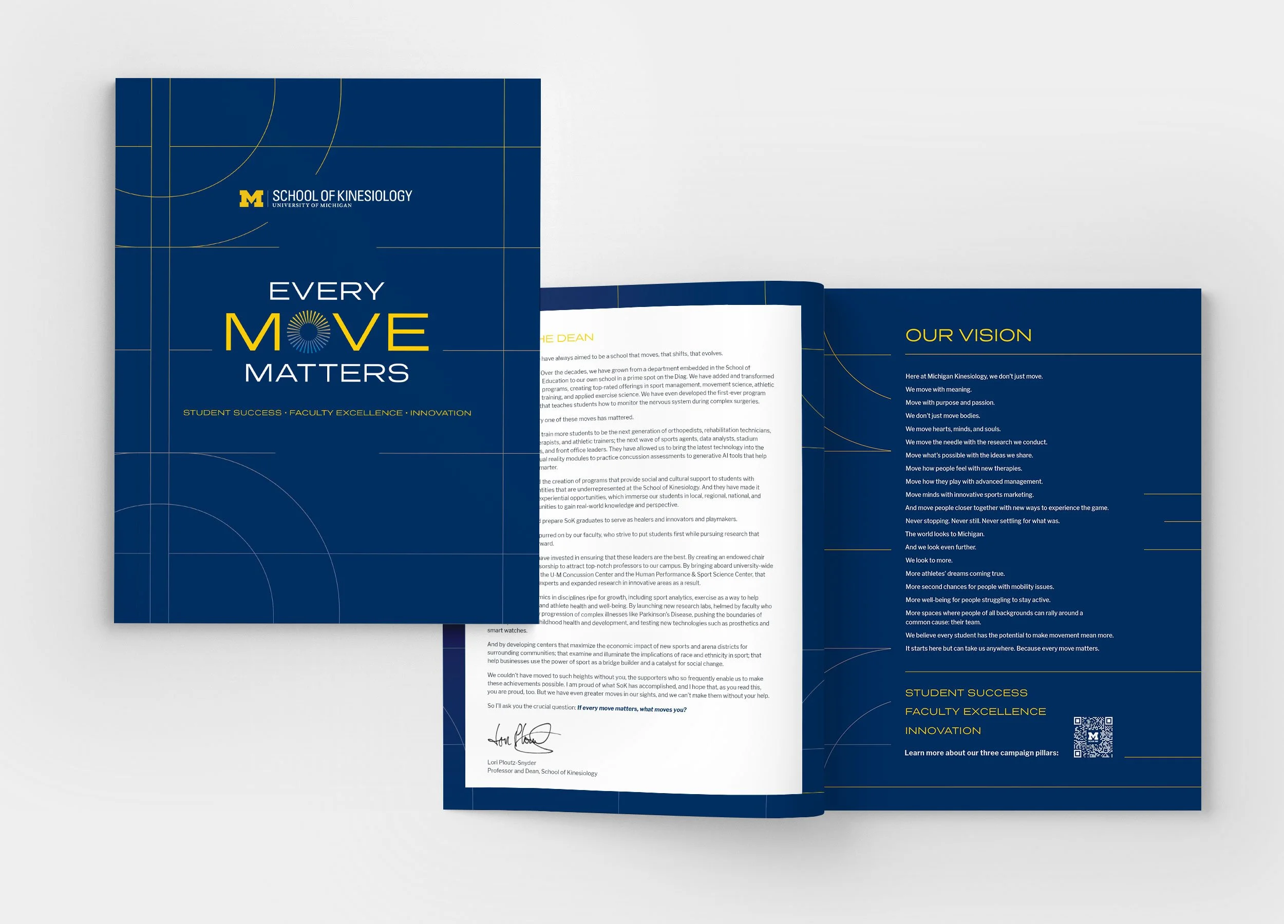
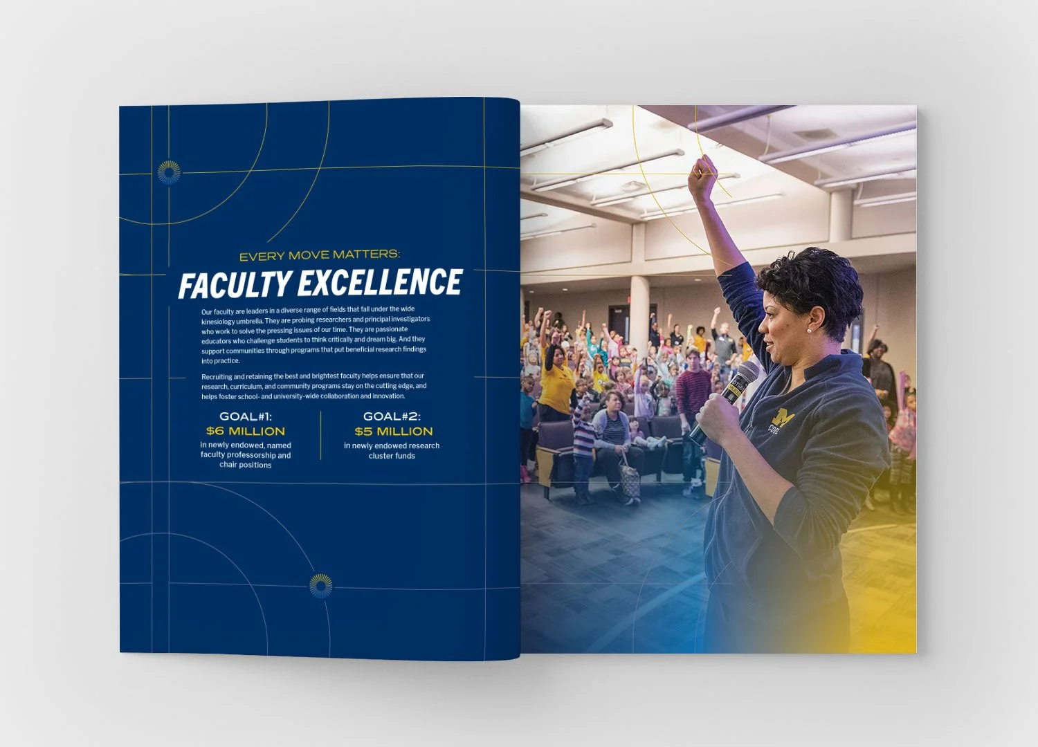
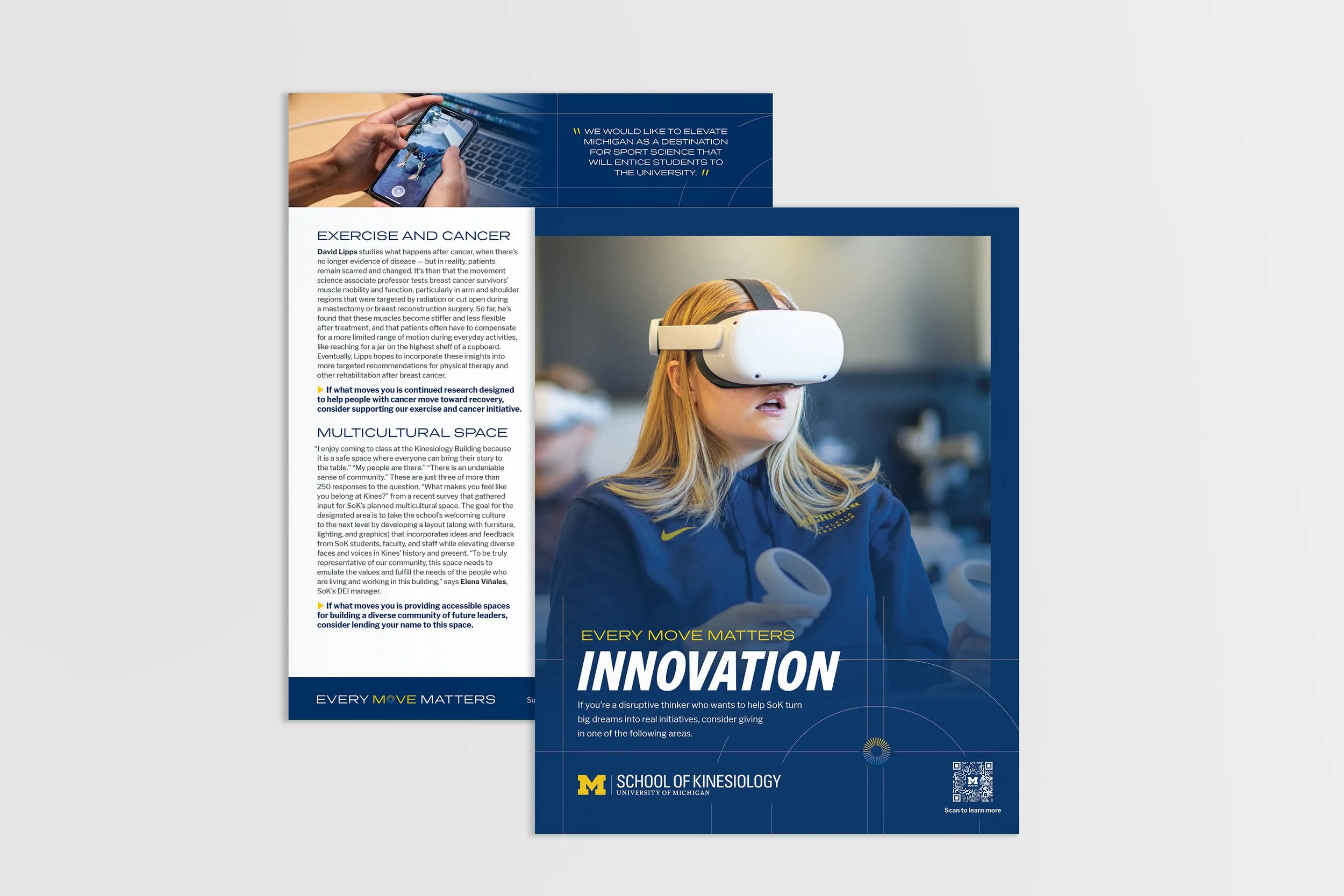
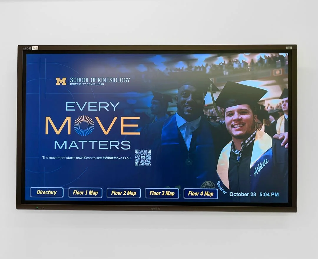
Putting it all together
“This was the best school-level campaign I’ve seen on campus.”


